Reviving a dormant 1954 Italian fashion house without flattening it into another quiet-luxury lookalike.
This project rebuilds Krizia as a contemporary luxury brand.
This project rebuilds Krizia as a contemporary luxury brand.
Founded in 1954 by Mariuccia Mandelli, Krizia was built on intellectual provocation: experimental knits, animal prints, and architectural silhouettes that treated clothing as structure rather than decoration. Yet today the name survives mostly in vintage archives, not contemporary fashion conversation.
The core challenge: how do you resurrect a dormant house without flattening its personality into another tasteful, heritage-brand cliché? Quiet luxury would be the safe, predictable move — but it would erase exactly what made Krizia worth remembering.
The house was genuinely avant-garde in its time: intellectual, a little confrontational, unafraid to treat clothing as an engineering problem rather than a decoration exercise. In recent years the name has largely faded from cultural relevance — the kind of heritage brand that shows up in vintage archives more often than on a runway. That's the real, verifiable starting point for this project: a strong original point of view with almost no contemporary presence to build from.
The easy version of this project is a minimal wordmark, a beige moodboard, and a promise of "timelessness" — the same move every fashion spec rebrand makes. That would erase exactly what made Krizia interesting: Mandelli's willingness to be a little strange, a little confrontational, in service of an idea about structure.
The brief I set for myself: build a system disciplined enough to read as serious luxury, without sanding off the intellectual edge that gave the original house its identity. Structure, not spectacle — restraint used as a point of view, not a lack of one.
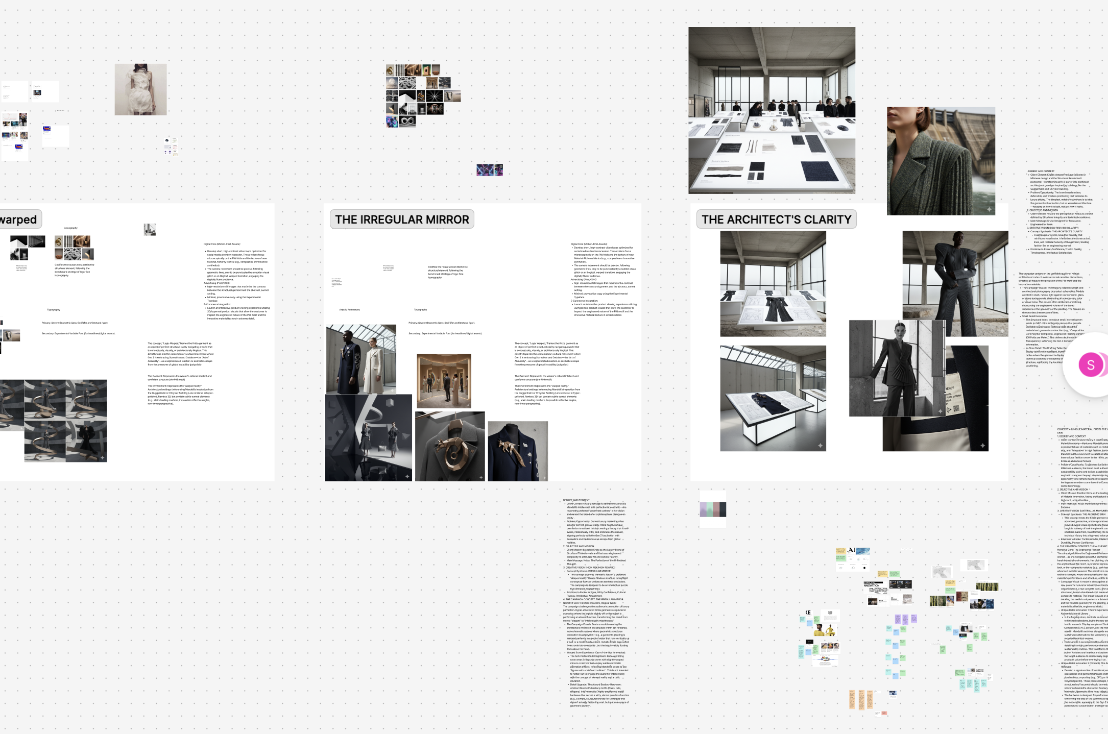
Rather than picking a single mood board and running with it, I developed three distinct creative territories far enough to test against each other — each with its own visual logic, campaign voice, and rationale.
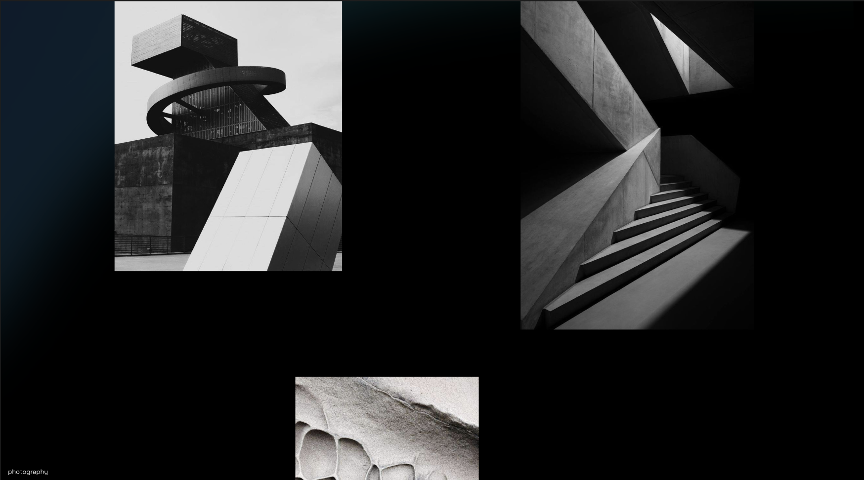
Krizia repositioned around structural honesty — garments photographed and discussed the way a building is: in terms of load, line, and material logic. Concrete, glass, and raw architectural space as the visual world; copy that reads like a design brief, not ad copy. Chosen because it gave the widest room to be both intellectual and visually striking, and because it let the brand's real strength — structural silhouette — become the entire story instead of a footnote.
A stranger, more surreal territory — distorted reflections, warped proportion, the idea that "truth lives in the detail" precisely because the overall silhouette lies to you first. More provocative than Architect's Clarity, but harder to sustain across practical applications like packaging and tags without losing legibility.
Leaned into absurdism and Gen-Z-coded irony as a reaction against algorithmic sameness in luxury marketing — the most conceptually daring option, and the one most likely to read as costume rather than clothing if executed at full intensity. Elements of its wit survived into the final tone of voice in smaller doses.
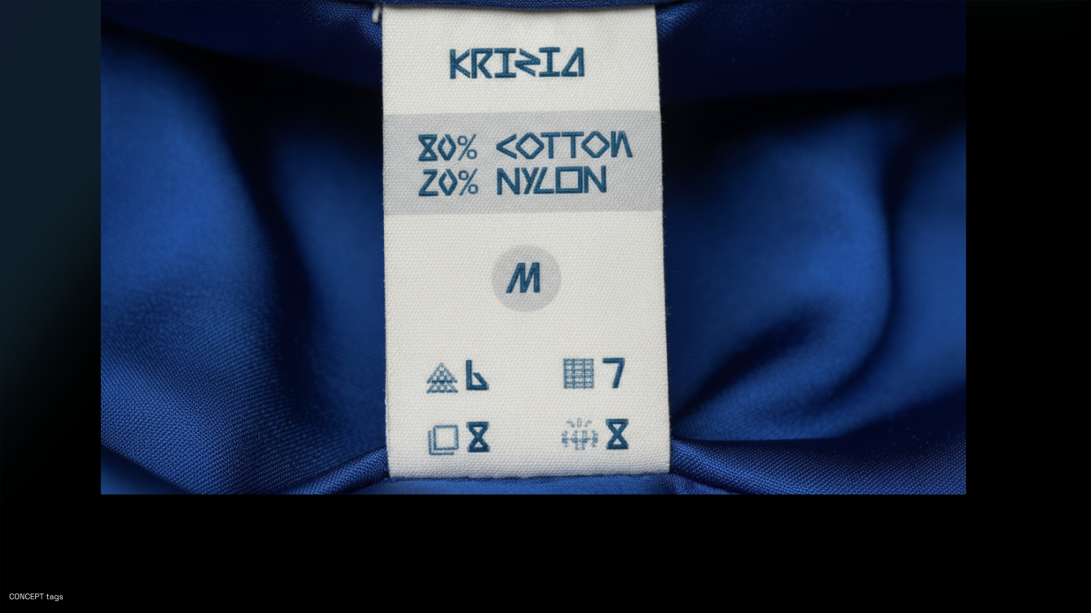
Transparency as luxury. An NFC-enabled garment passport revealing pleating density, material composition, and origin verification.
Retail as an architect's studio. A hybrid environment between material laboratory and gallery space for technical studies.
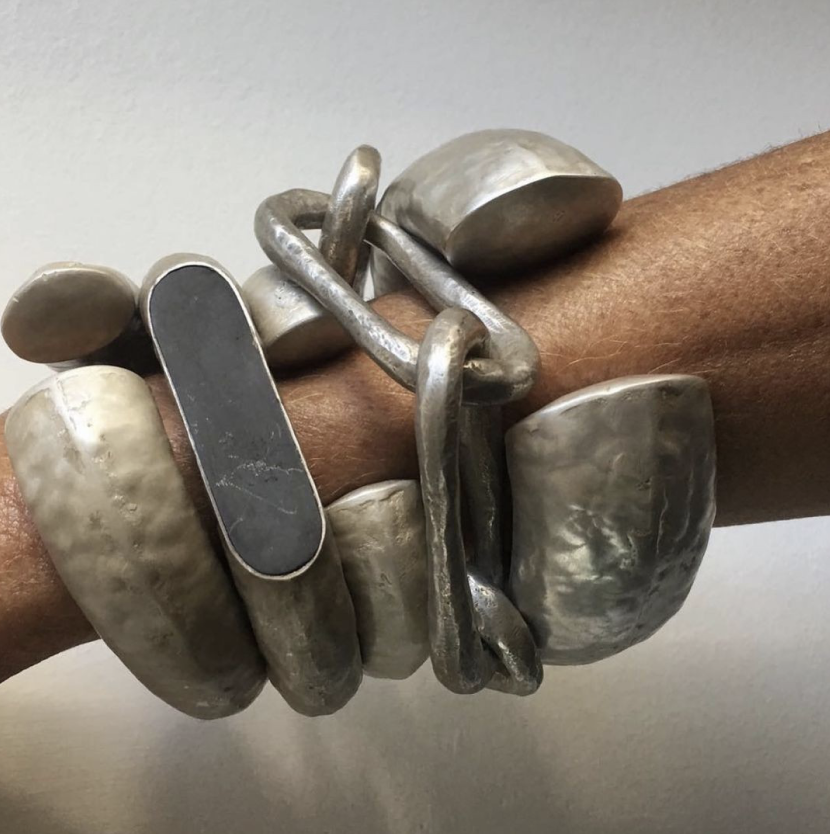
Material as experience. An interactive installation showcasing cork polymer composites, metallic fabrics, and bio-engineered materials.
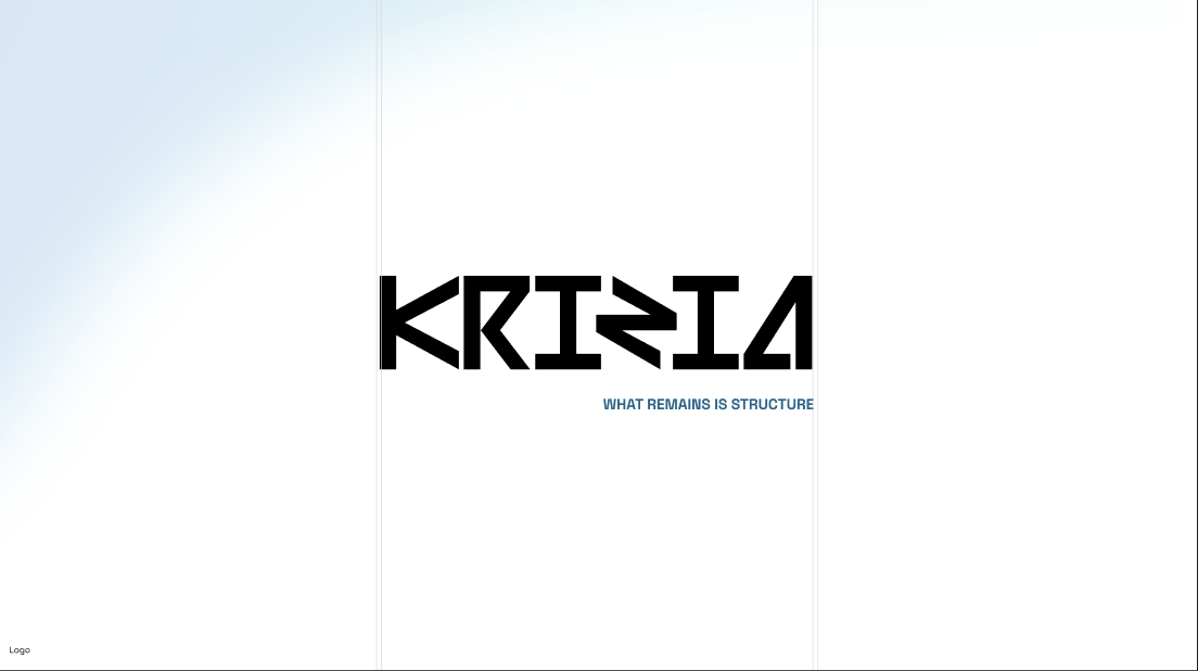
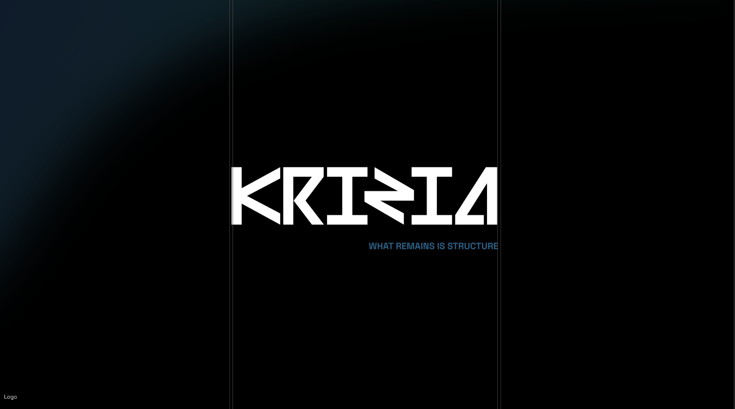
The custom geometric letterforms deliberately avoid the swash and softness common to fashion wordmarks — sharp terminals, consistent stroke logic, built more like technical lettering than calligraphy. Paired with a single line that carries the whole strategy: "What remains is structure."
A near-black base with a single petrol-blue accent, used deliberately sparingly — the opposite of the multi-accent palettes common in fashion branding. Space Grotesk carries both display and body roles, keeping the system to one typeface family rather than a display/body pairing.
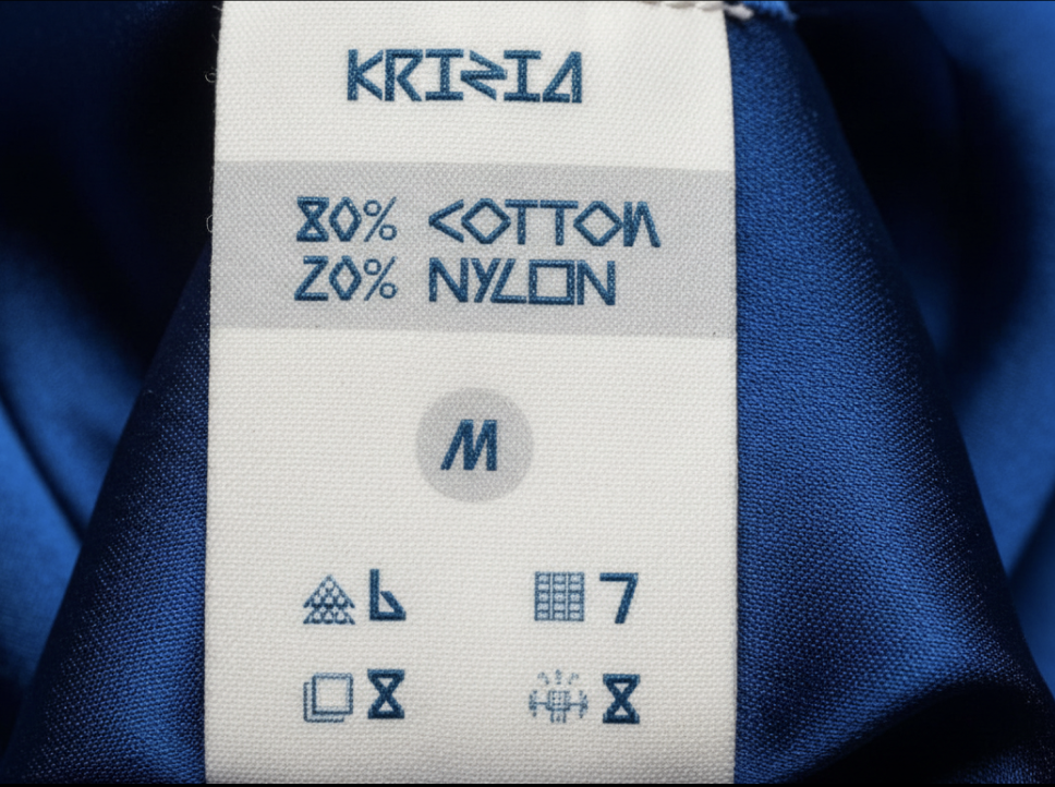
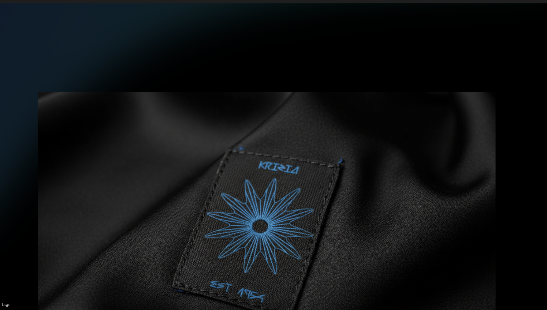
A radiating starburst emblem functions as a secondary mark for garment tags and hardware — a nod to the brand's founding year rather than a literal logo replacement. Care labels carry a fully custom pictogram set instead of licensed washing-symbol icons, so even a utilitarian tag reads as part of the same design language.
A logo is easy to make look good in isolation. The real test is whether the same voice survives contact with an invitation, a billboard, a tote bag, and a phone screen without feeling like four different studios worked on it.
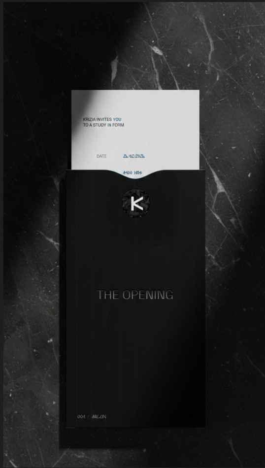
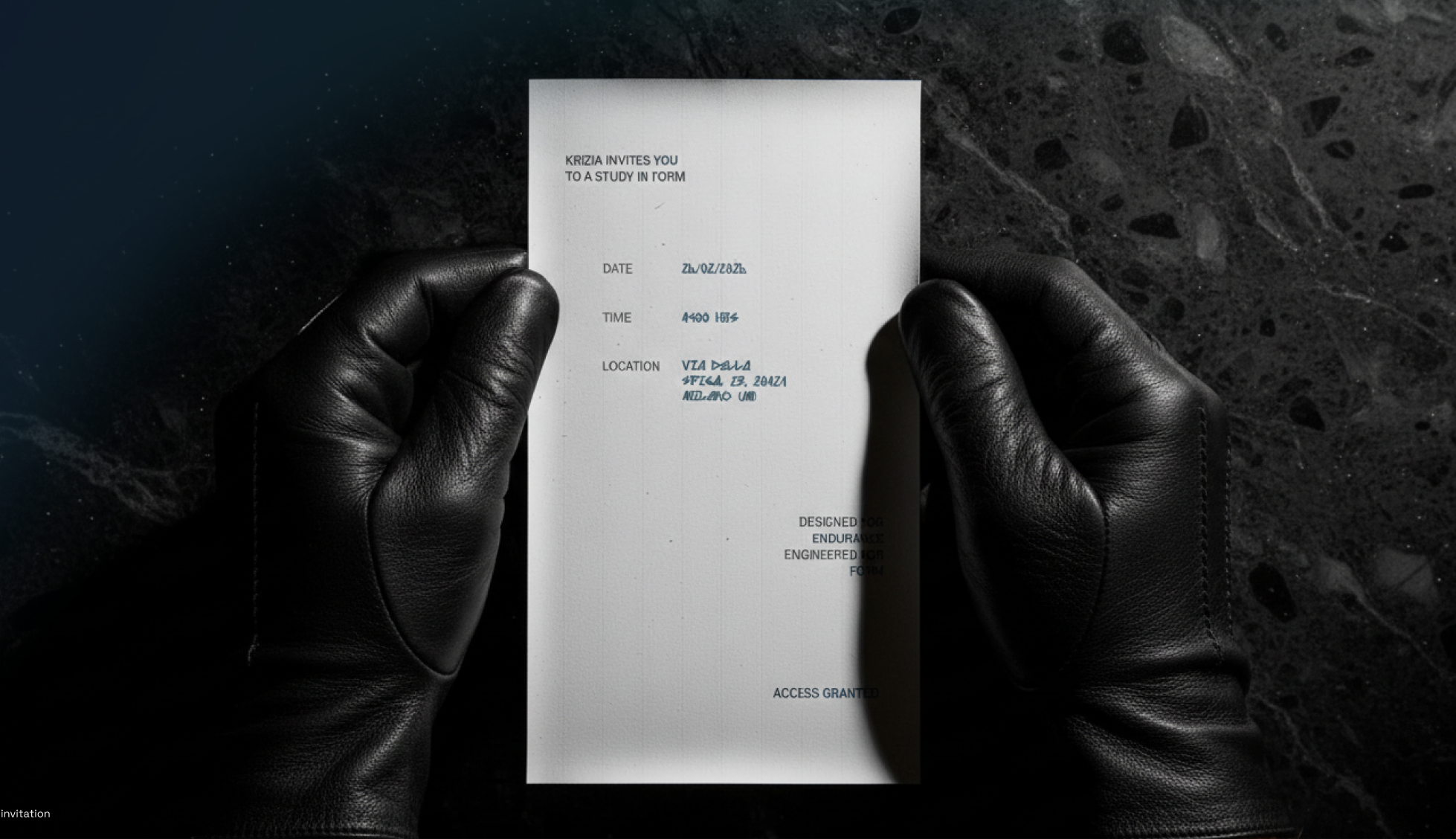
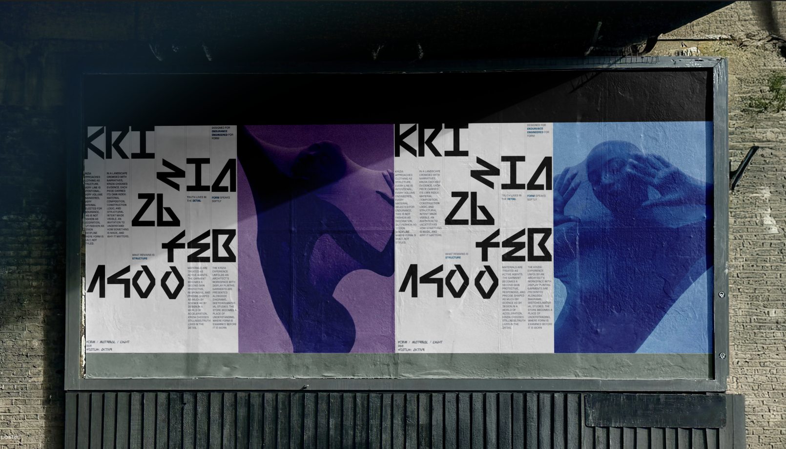
An event invitation framed as an access pass rather than a party invite — "Krizia invites you to a study in form," stamped "Access Granted" — and a billboard campaign built from the same fragmented, architectural-copy voice ("Form speaks softly," "Truth lives in the detail").
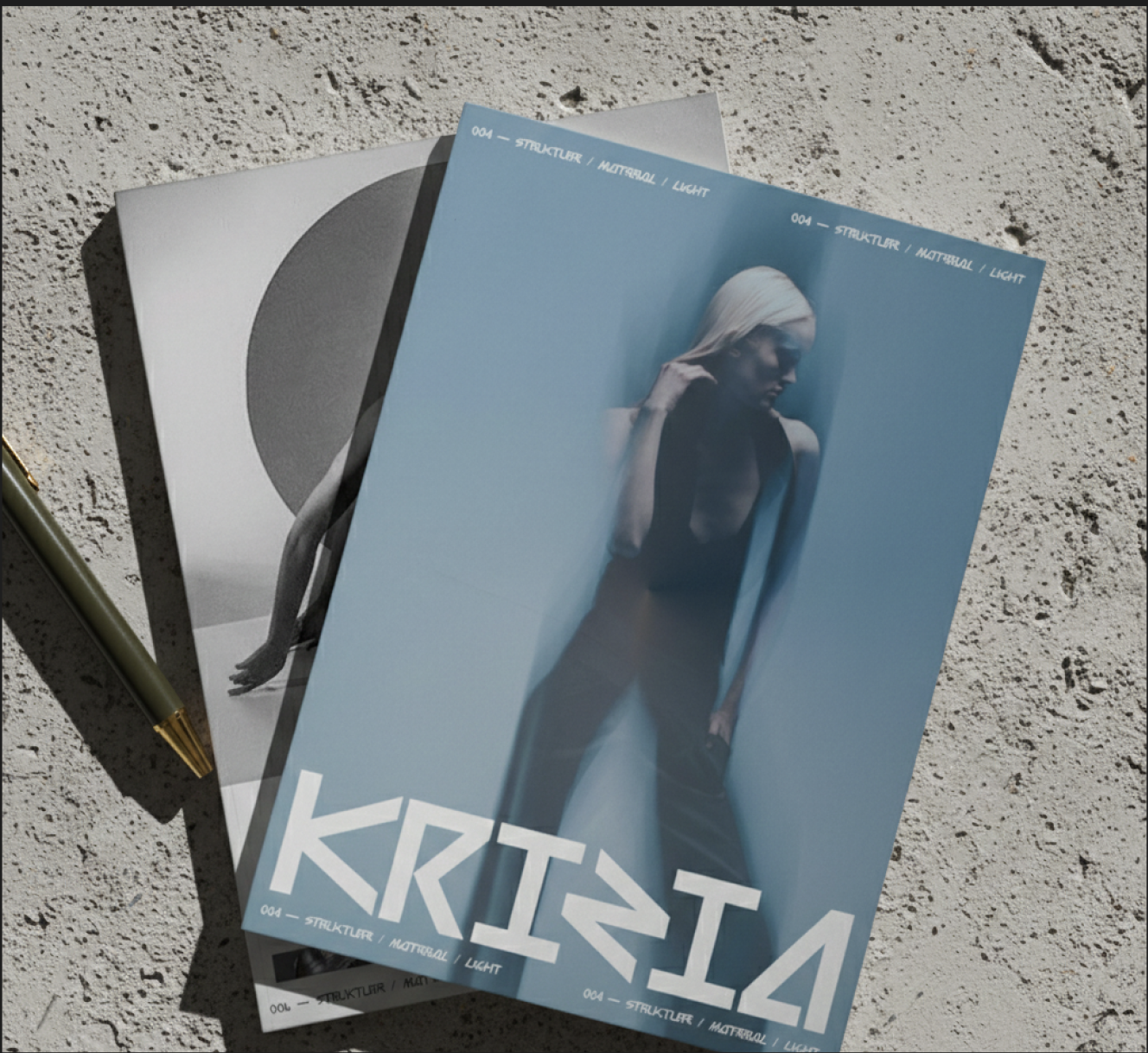
A quarterly-style print object ("004 — Struktur / Material / Light") gives the brand a reason to publish thinking, not just product — extending the tone of voice into long-form content rather than only campaign one-liners.
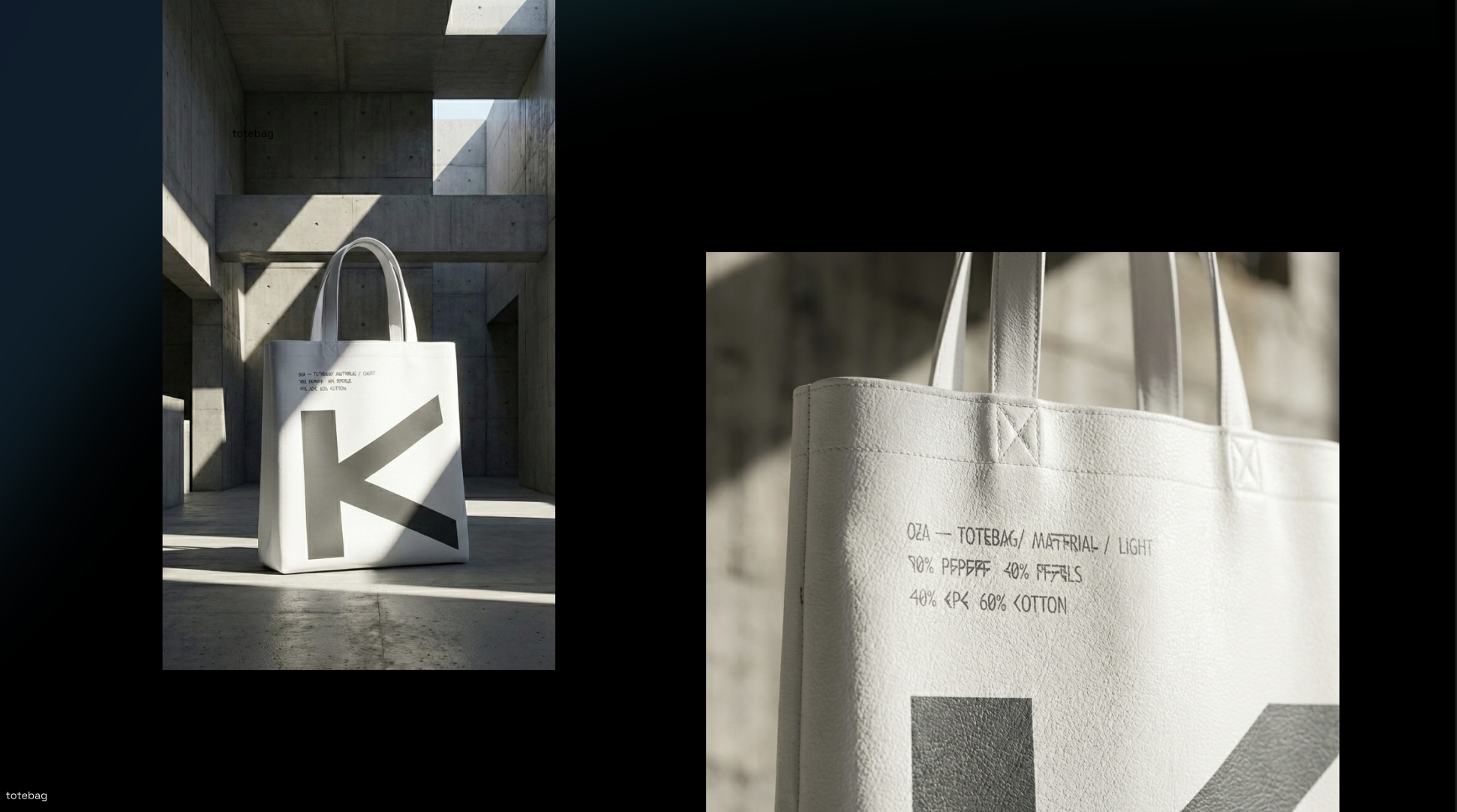
An oversized, cropped "K" on a tote bag borrows scale from the billboard work rather than shrinking the logo down politely — the same confidence applied to a cheap, high-frequency product as to the hero campaign.
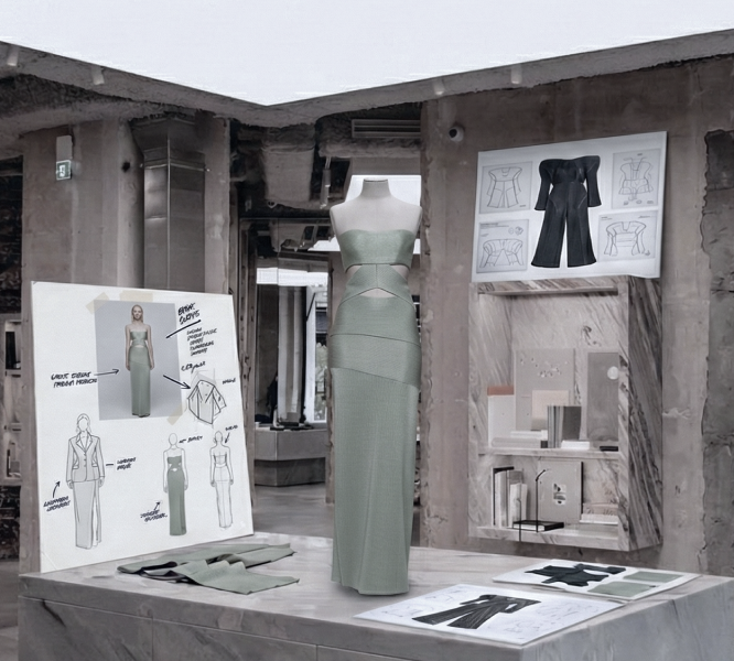
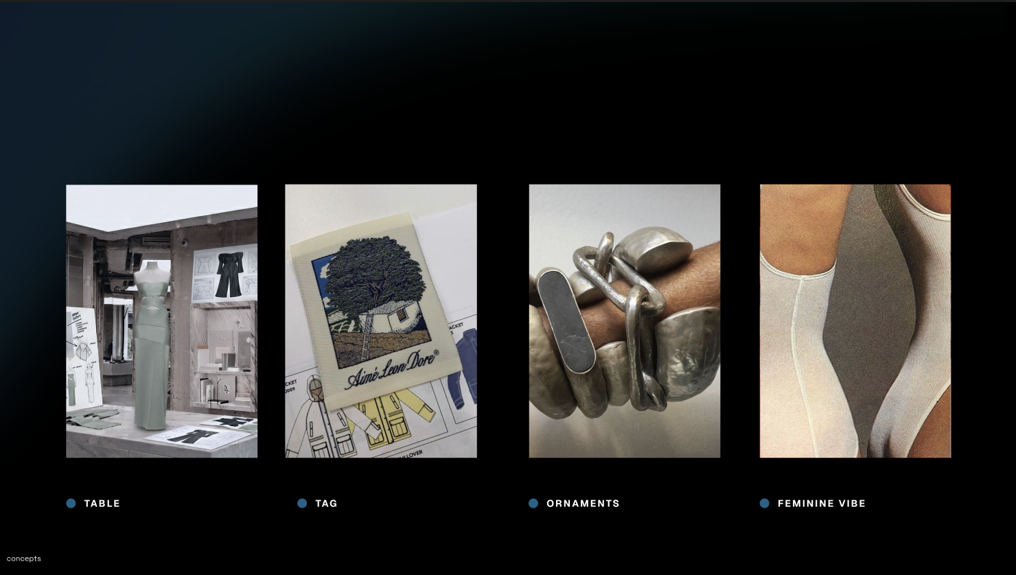
A physical prototype garment (asymmetric, structural, in a muted sage tone) shown alongside its own construction sketches and fabric swatches, proof the brand language extends past graphic design into an actual point of view on garment construction.
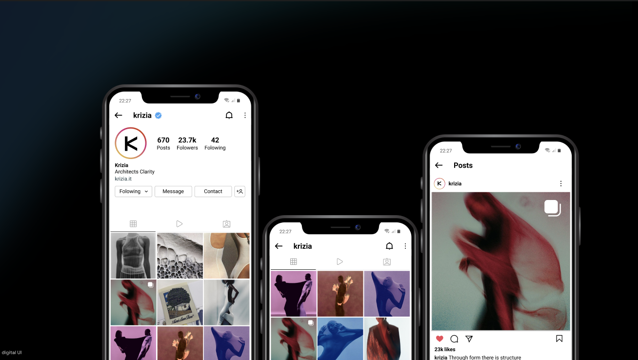
Social presence and motion pieces carry the same restraint — no feed of product shots, more of a slow-moving visual diary. Three short pieces show the identity in motion: a title/trailer film, a kinetic version of the poster campaign, and a walkthrough of an early web prototype.
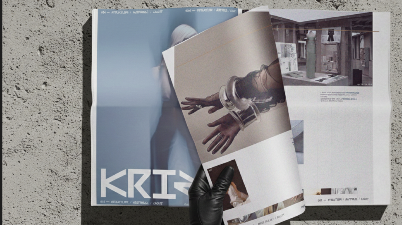
A magazine-editorial artifact documenting the philosophy of the brand. KRIZIA INDEX merges material studies with cultural storytelling to build meaning beyond the product.
The rebrand transformed Krizia from a heritage fashion label into a contemporary architectural luxury house centered on design intelligence and material innovation.
The project demonstrated how: