Case study · olo

A social-confidence app with no audience.

Social and habit apps grow through visibility: feeds, streaks, leaderboards. For people with social anxiety, that visibility is exactly why they quit. I led a two-person team for two months to answer one question: what does an app that helps you talk to people look like once you take the audience out?

My role
Design lead
Team
Me + Cosima Wagner
Timeline
~2 months
Status
Concept · not shipped
The problem

The people who most need social practice avoid the apps built for it, because those apps put them on show.

What I owned

Product direction, the scope calls below, the usability test plan, and the challenge-screen system.

The hardest call

Cutting the community feed, and with it the main way olo could have connected people.

Result (honest)

Testing with 4 people changed 4 core features. There's no live build, so no usage data. One big question is still open.

Everything that makes social apps grow is what makes anxious users leave.

We audited three apps that ask strangers to interact: BeReal, Randonautica and Meetup. The same mechanics that drive engagement for confident users (public posting windows, open group chats, visible activity) were the top complaints from anxious ones. Our empathy research said the same thing in the users' own words: being watched is the trigger, not a lack of motivation.

What was unclear going in

  1. Can you build social confidence with almost no social features?→ Decisions 01 and 03
  2. How much push helps before it becomes pressure?→ Decision 02
  3. Can one challenge fit people who range from "extremely shy" to "mostly fine"?→ Smaller calls
What I aimed to change

Get an anxious first-time user to do one real-world social action, without feeling watched.

Not daily active users, and not time in app. The product succeeds when someone puts their phone down and says hi to a barista.

2 months 2 designers, no engineers No live build 4 test participants 18 survey responses

This is the aim, not a measured result. Without a build, nothing could be measured in the field.

I led a team of two. Here's where the calls were mine.

Mine

  • Product direction and scopePicked between the two concepts and decided what to cut: the map, the event radar, the feed.
  • Usability test planThe 7-task protocol, the three evaluation criteria and the success thresholds set before testing.
  • Turning findings into changesTook each test finding through to a product change (see the before/after under Result).
  • The challenge-screen systemFour iterations, from a single screen to a structure that works for any challenge type.

Shared with Cosima

  • Research: empathy map, four personas, competitor SWOT
  • Concept sketching and the naming survey
  • Visual language and the component sheet

Three calls that shaped the product, and what each one cost.

Decision 01 · Product direction

A map of nearby strangers, or a private companion?

Situation
Research gave us two concepts pulling in opposite directions. One connected people fast but exposed them. The other felt safe but risked becoming a journal that never got anyone out of the house.
Options
  • A
    Live map of nearby, comfort-matched people with buddy mode. The fastest route to real connection, but you're visible to strangers.
  • B
    Private companion with a diary, event radar and calming sounds. Safe, but passive.
  • C
    Hybrid: B's private loop, A's mood-matching, and real-world micro-challenges as the bridge between the two.Chosen
Trade-off
I cut the map and the event radar, so olo can't introduce you to anyone. It gets you ready to talk to people who are already around you.
Evidence
Visibility was the most common threat in the SWOT across all three competitors, and the main trigger in the empathy map.
Concept A (left) and Concept B (right). Click to enlarge.
Decision 02 · Pressure

Keep a short countdown on challenges, or remove it?

Situation
The challenge screen we tested had a 2-minute countdown. The idea was that a deadline gives structure and gets people to finish, which is a standard habit-app lever.
Options
  • A
    Keep the timer and soften the copy.
  • B
    Make it opt-in for users who want a push.
  • C
    Remove timers everywhere. Show an estimated duration chip as information only, not a deadline.Chosen
Trade-off
We lost our only in-the-moment nudge. If someone hesitates mid-challenge, nothing pushes them over the line.
Evidence
3 of 4 testers felt uncomfortable or pressured by the countdown. Even a short one read as a deadline.Usability testing, 4 participants
Challenge screen, V2 to V4. Duration became information, not a deadline.
Decision 03 · Social layer

Soften the community feed, or cut it?

Situation
The prototype we tested had a feed: seeing others' progress and reacting to posts. It was the one place where olo users met each other, and every competitor had one.
Options
  • A
    Keep the feed, with anonymous posting.
  • B
    Friends-only feed with no reactions or counts.
  • C
    Cut it. Give its home-screen space to Safe Zone filters and Cultural Tips.Chosen
Trade-off
No social proof and no community. Testers still said they wanted connection, so this call left a real need unmet. See the learning under Result.
Evidence
"Not of importance right now." All 4 testers independently valued Safe Zone and Cultural Tips, features we'd treated as secondary.Usability testing, 4 participants
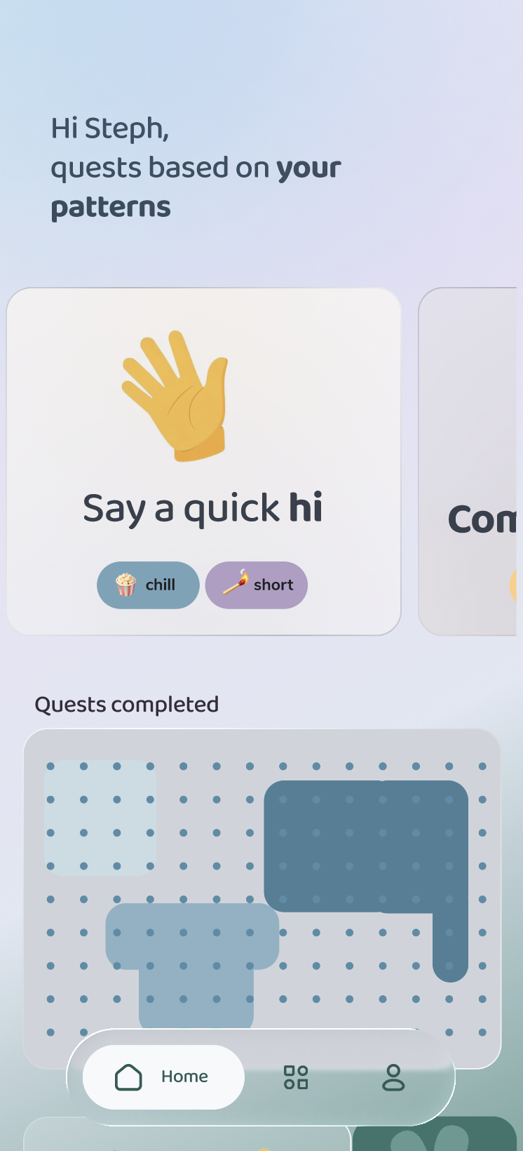
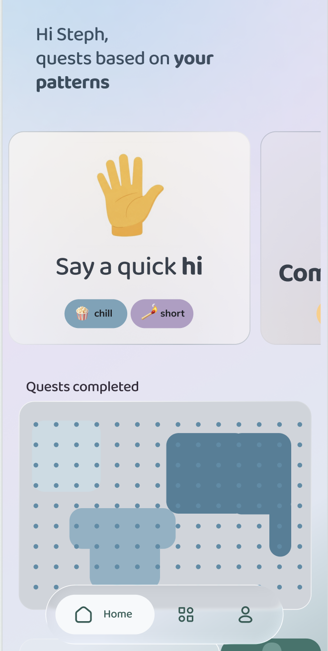
The final home screen, and the change log from testing.

Smaller calls

CallChoseOverBecause
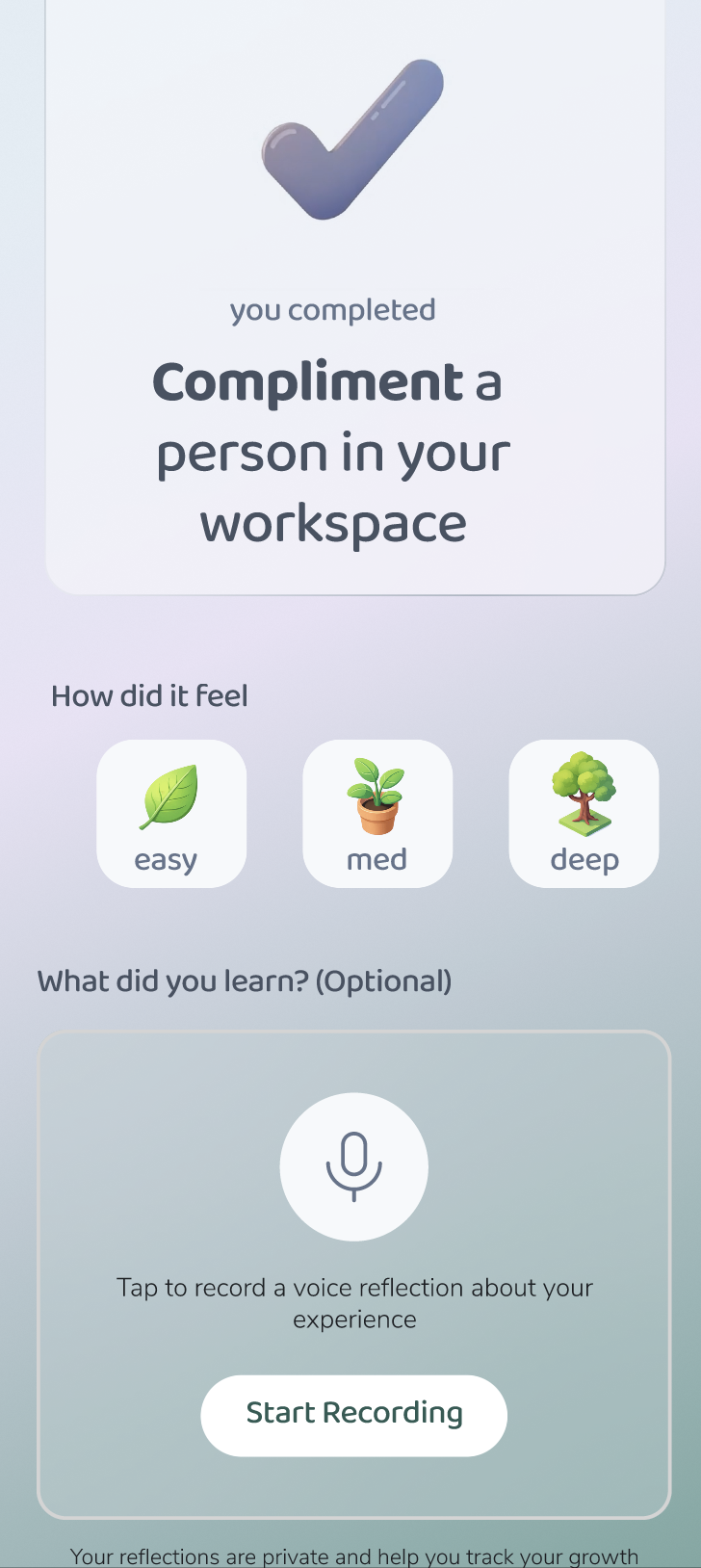
Challenge intensityThree tiers (easy / med / deep), shown as a sprout growing into a treeOne fixed daily challengeTesters ranged from "extremely shy" to extrovert
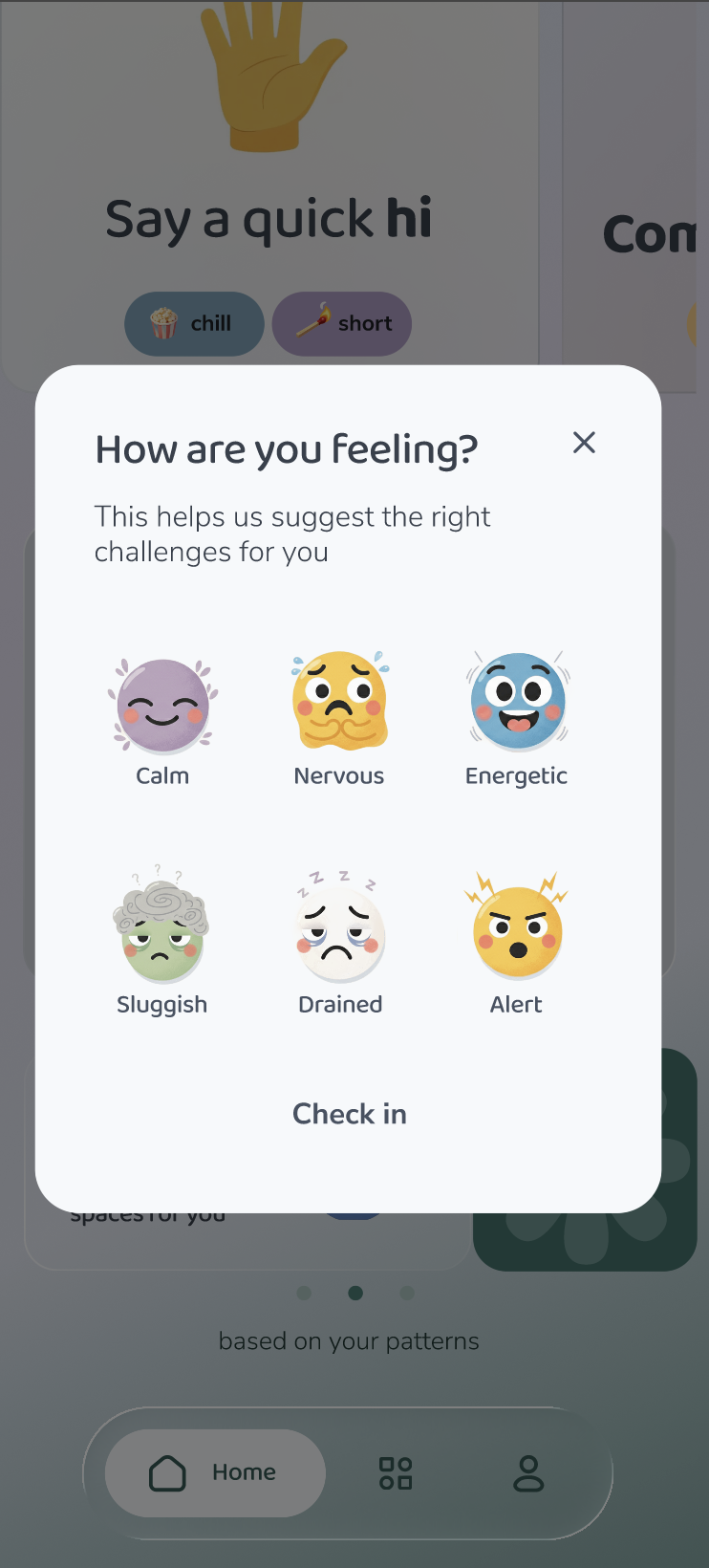
Mood inputSix plain-language statesA 1–10 sliderTesters read the slider as clinical
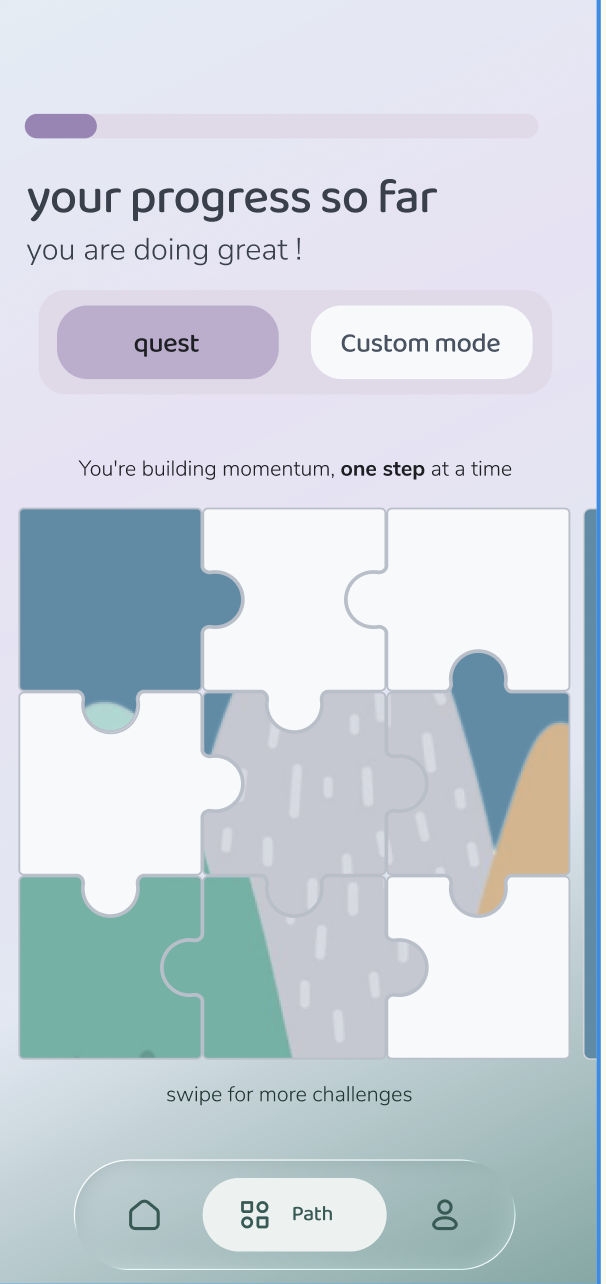
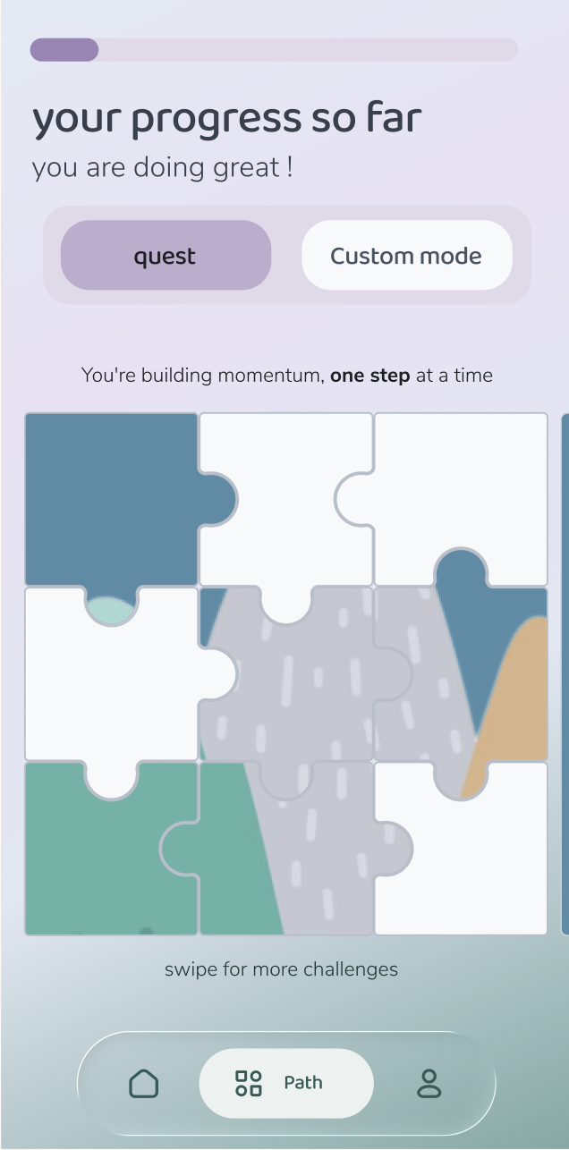
ProgressA private puzzle that fills inStreaks and leaderboardsShy testers wanted reassurance, not a score
Name"olo""Elo", "Bloom""Elo" echoes ranking systems and "Bloom" read as therapy (18-response survey)

What changed because of the work.

olo was never built, so there's no retention data. What I can show is how testing changed the product, and what people said.

Before testing

  • One fixed-intensity daily challenge
  • Countdown timer on the challenge screen
  • Generic motivational tips
  • Public feed as a core surface

After testing

  • Three difficulty tiers
  • No timers anywhere in the product
  • Concrete tips ("start with people you see regularly")
  • Feed removed; Safe Zone and Cultural Tips promoted to home

Qualitative proof

“

It was nerve-wracking at first, but the barista was really friendly. I felt proud afterwards.

Tester reflection after a challenge
4 / 4

testers independently called navigation "clean, simple and easy", so I left the four-tab structure alone.

Usability testing
4.0 / 5

average concept-understanding score, before the rename to olo.

Concept survey, 18 responses
What I'd do differently

I solved "visible", and gave up on "social" along with it.

Cutting the feed was the right call for safety. But testers still asked for connection, and I treated "no visible social features" as if it meant "no social features". The next step is an opt-in, low-visibility way to meet one other person. That isn't a feed; it's closer to Concept A's buddy mode, with stricter controls.

If it shipped: targets, not results

What I'd measure

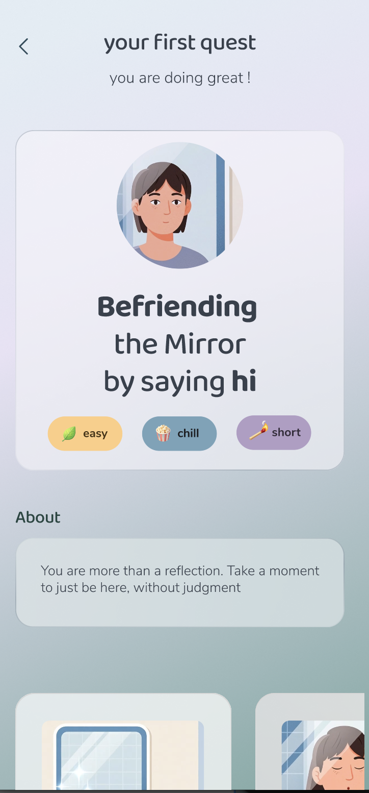
  • First-challenge completionThe share of new users who finish "Befriending the Mirror" in their first session.
  • Step-up rateHow many users move from easy to medium challenges within two weeks.
  • Return after a skipped dayWithout streaks, does a missed day still end the habit?

Limitations: 4 usability participants and 18 survey responses give a direction, not statistical proof. No formal WCAG audit was run yet.

Five steps, and no feed.

How it works: tap a step to see how olo moves someone from a mood check to a real-world moment and back to private reflection.

01. Mood check-in

olo opens with six plain-language states (Calm, Nervous, Energetic, Sluggish, Drained, Alert) instead of a 1–10 slider, which testers read as clinical. The state you pick shapes everything that follows.

Onboarding also asks what brings you here (build confidence, prepare for conversations, make 1–2 friends) and what feels hardest, so day-one challenges are personalised, not generic.
Check in screen Receive screen Act screen Reflect screen Grow screen

The full research trail.

For anyone who wants the full trail: everything behind the decisions above. Open any section.

01Empathy mapThe moment before saying hello
Says

"Is now a good time? No, they look busy. I'll wait." Rehearses a sentence three times before saying it.

Does

Pulls out their phone the moment things feel awkward, using it as a shield. Unlocks and re-locks it without reading anything.

Feels

Heart racing, palms sweating. "Vulnerable… hopeful but terrified of rejection."

Pain

"Not knowing what to say after 'Hello.'" Worries that the effort will come across as "creepy".

02PersonasFour kinds of introversion
Tushar
Comfortable, but stuck

Fine in familiar company but rarely starts anything new. His gap is starting conversations, not confidence.

Shaswat
Overthinker

Plans conversations in advance and gives up if the moment doesn't arrive exactly as rehearsed.

Zaida
Selectively social

Comfortable one-on-one but drains fast in groups. She needs a way out more than encouragement.

Liza
Newly relocated

Motivated to build a social circle in a new city, but has no low-stakes way to start from zero.

03Concepts and namingTwo concepts, three names, one survey

Both concepts are covered in Decision 01. Here is the naming survey (18 responses) that ruled out the working names.

"Bloom": do you understand the concept?

Avg. 4.00 / 5
Level 5
6
Level 4
8
Level 3
2
Level 2
2

"Is Elo something that applies to you?"

18 responses
Yes
44%
Somewhat
39%
No
17%
04BenchmarkingDuolingo, Headspace and Calm, compared on calm vs. push

I took the calm half of the spectrum, Headspace's reassuring tone and Calm's restraint, and left out Duolingo's high-pressure gamification.

DimensionDuolingoHeadspaceCalmolo
MoodEnergetic, gamifiedCalm, reassuringDeep relaxationCalm and reassuring
GamificationAggressiveLow-keyVery lowLow-key, opt-in
IllustrationChunky, cartoonishMinimal, abstractPhotographyMinimal, non-identifying
Tone of copyMotivating"When you're ready"PoeticCalm and guided
05Colour researchEach accent colour tied to a published finding

Green sits at the centre of the visible spectrum and needs the least adjustment to perceive, so it reads as restful.

Akers et al. (2012)

Blue is the most consistently calming colour across studies.

Stone (2003)

A muted terracotta reads as sociable without red's alarm-like intensity.

Elliot & Aarts (2011)

Yellow lifts mood, but too much of it raises arousal, so it's used for optimism, never for alerts.

Yildirim et al. (2011)
06Challenge-screen iterationsFrom one screen (V1) to a system (V4)

V1 was content-first and text-heavy. V2 introduced the structure that stayed: chips, numbered steps, tips. V3 added illustration and affirmation copy. V4 applied the same structure to a second challenge type to prove it scales.

07Usability test protocol7 tasks, 3 criteria, 4 participants matched to the personas
  1. Complete onboarding
    Do users understand how we gauge comfort zones and social energy?
  2. Log your mood
    Is emotional capture simple?
  3. Explore the home screen
    Where do users naturally click?
  4. Attempt a daily challenge
    Is it clear and emotionally comfortable?
  5. React to a post in the feed
    Does it trigger fear of judgement?
  6. Use the QR connect flow
    Social comfort and usability
  7. Check progress and settings
    Is the information hierarchy right?

Thresholds set before testing

These were the rubric, not reported results.

Task success>85% without help
Time on taskOnboarding <90s · mood log <10s
Error rate<2 misclicks per task
Clarity8+ / 10
Anxiety trigger check<10% report discomfort
Would recommend8+ / 10